
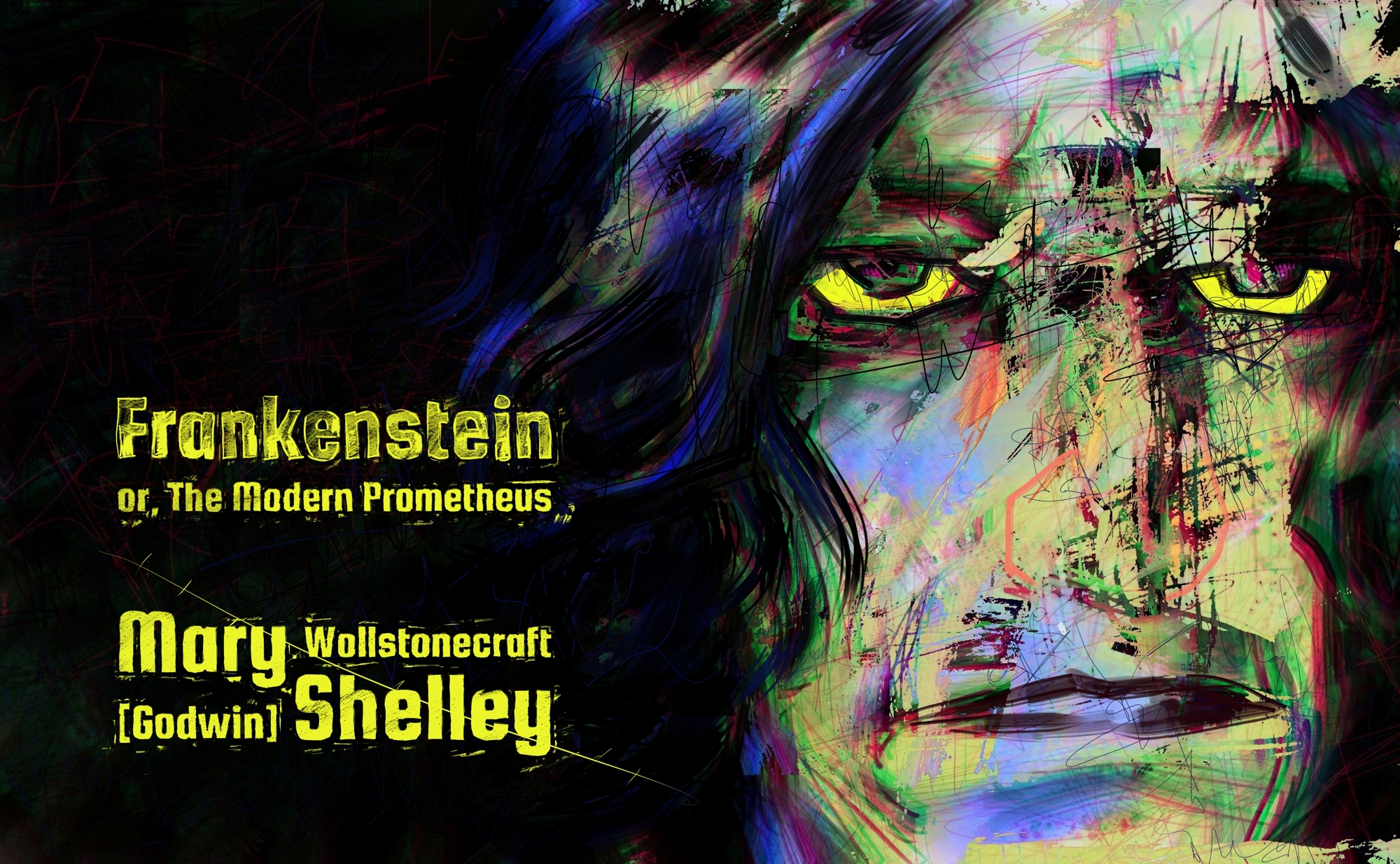
I used to make these crazy things called pods — self-contained webnovels that were downloadable and worked offline. I don’t make them anymore because they were cumbersome and ePub3 format allows the HTML and CSS features I wanted my books to have.
Years ago, I published six titles as pods and minted them as NFTs on Cardano under my publishing brand, dark mode press. I’m now in the process of converting them into ePubs. That means redoing the art to fit a vertical instead of horizontal format, so it’s taking a while. In the mean time, here’s what the pod looked like.
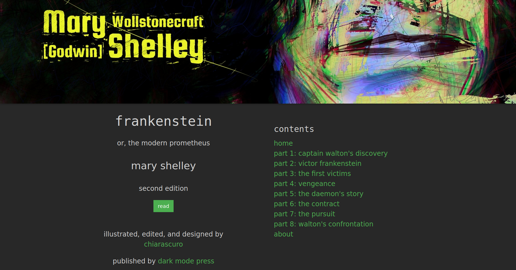
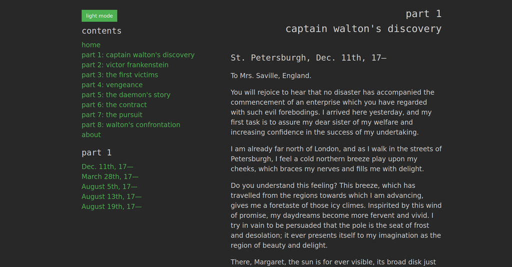
Like all the pods in the initial round, this one is made up of multiple HTML files. Since then I’ve started making them all one page so that the user does not have to contend with finding the home page in a rat’s nest of other HTML files.
That works a lot better in terms of user experience.
This edition has four interior jumbotron illustrations. Here is the bottom part of the drawing showing Captain Walton’s boat, trapped between icebergs in an arctic sea. (I know it looks like a crudely-rendered cowboy hat. I have no patience for draftsmanship anymore.)
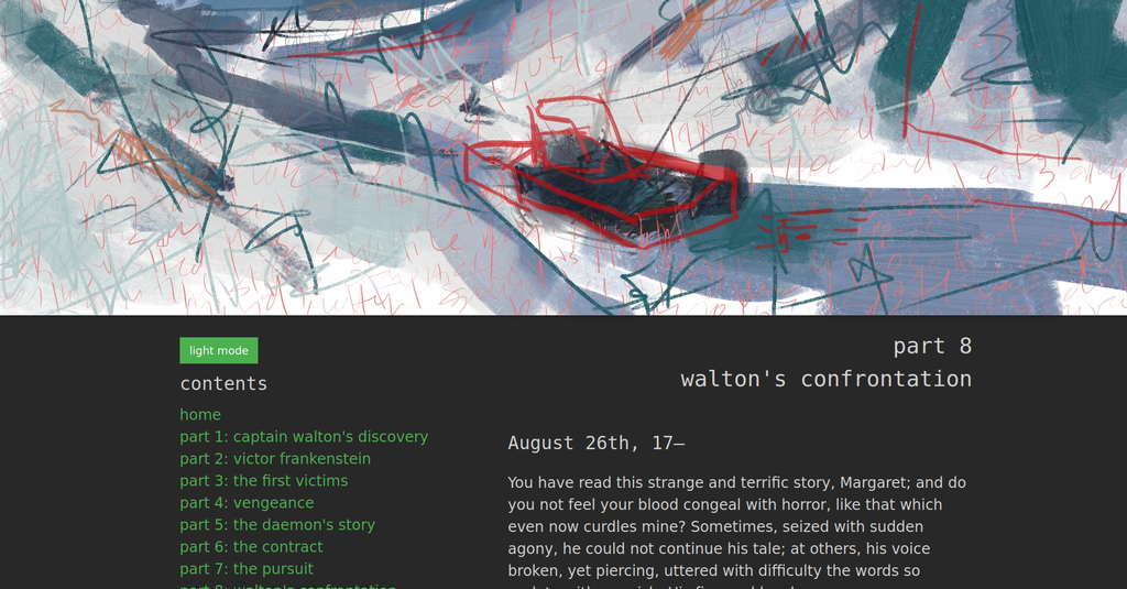
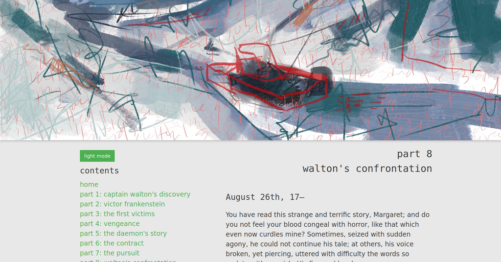
Why do I make books look like web pages?
Because web pages have a more accessible and user-friendly interface than traditional ebooks, and web design tools like JavaScript and CSS frameworks and grids offer so much more for accessibility design.
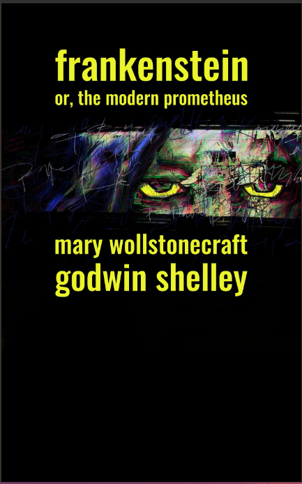
I did make an EPUB of this, too, and updated the cover design to fit in a vertical format with a typeface that’s easier to read.
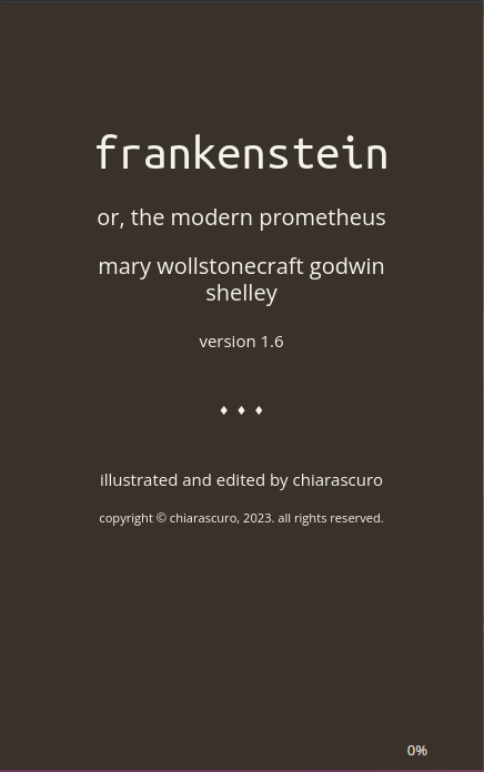
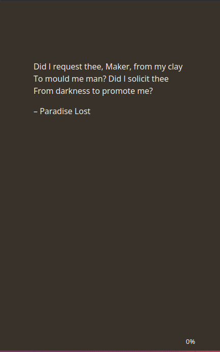
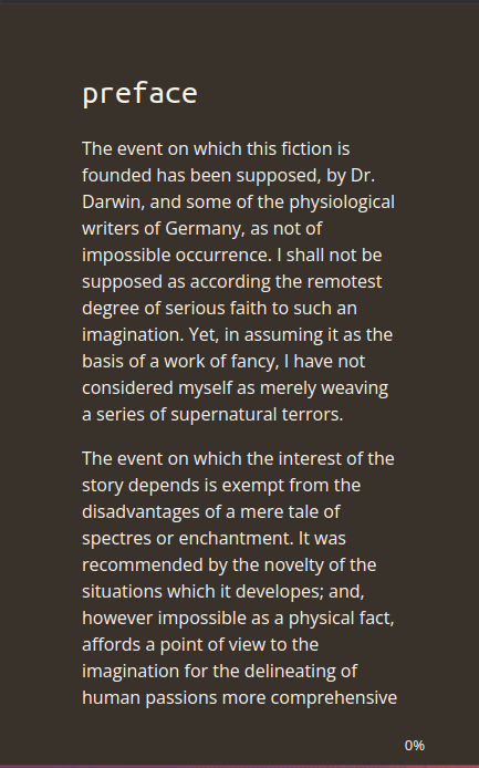
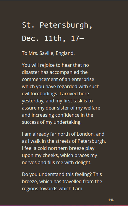
My template needs a tweak or two before I make any more of these. Mainly to decrease the right and left margins, since Calibre generates its own CSS for that. My style sheet appears to be tossing in an unnecessary pinch of salt.


Leave a Reply