
This is my second edition of this incredible book.
The first edition has a sidebar with the contents navigation, but the second edition has no sidebar. The light mode and dyslexia mode toggles and contents menu are all contained within the main content area.
On a mobile screen, it doesn’t look much different. On a desktop screen, it means the main content area is allowed to live in the middle of the screen width instead of being pushed over to the right.
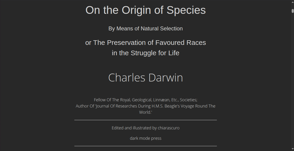
Having the title page info sitting next to the content navigation was too crowded. The design is more streamlined now, and the title page doesn’t have to share a row with a menu full of brightly-colored links.
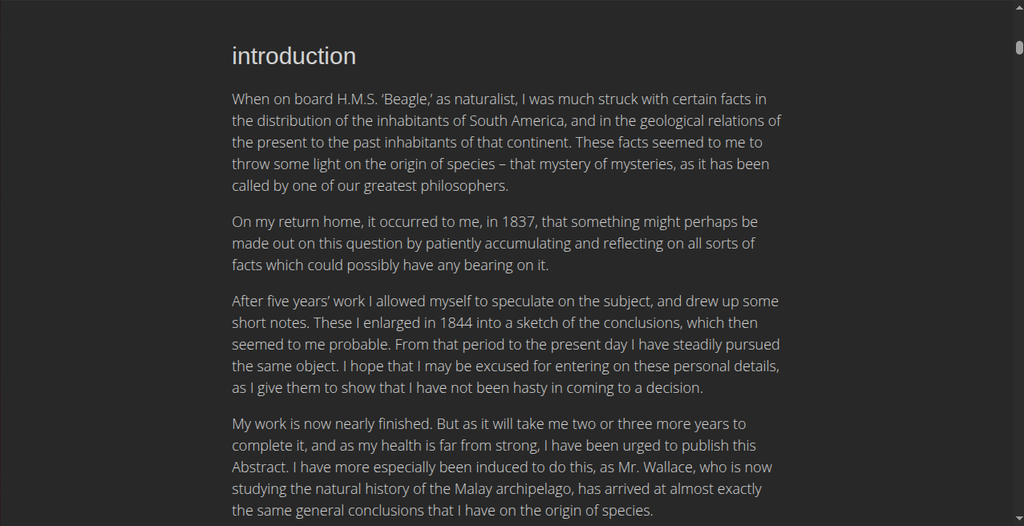
The text itself benefits from not having to sit next to the contents menu, too. It’s a challenging enough read. It’s best without the distraction of any other elements on the screen.
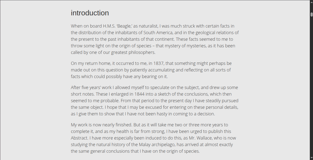
I always make HTML books in dark mode by default. That way, if your eyes are sensitive to light, you don’t get blasted by white light when you first open it.
My new template has a dyslexia mode toggle, too. It triggers a different set of CSS rules applied to paragraph text that increases the font size and letter- and word-spacing to make it easier for people who experience visual distortions while reading.
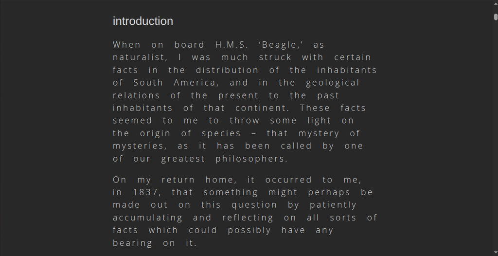
The toggles are powered by a few lines of JavaScript in the footer. And they work independently of each other to give the reader greater control over text display.
Our brains don’t all process visual information the same way, and inclusivity is not that hard if it’s a priority. Hell, it’s great practice in creative problem-solving.


Leave a Reply